
Welcome to the Responsive Attributes Generator!
Are you at the right place?!
While frameworks boost development speed and offer built-in responsiveness, let's be honest:
nobody uses all their components.
Craving a leaner, framework-free approach to responsive UIs?
You've come to the right place!
Particular framework?!
Developers have their preferences regarding the use of one tool over another. This is why the Responsive Attributes Generator allows you to generate a stylesheet with the breakpoints of your preferred CSS framework, making you instantly feel at home!
How does it work?
The generated stylesheet gives you the framework's breakpoints, but instead of remembering
complex class names, you'll use simple data attributes in your HTML.
Want to see how this simplified approach works? Check out the creator's
5-minute tutorial
on generating responsive CSS grid layouts with just HTML.
Responsive design has never been easier!
Notable differences!
The following values have different names in the Responsive Attributes' tutorial compared to the generated stylesheet:
| Value in Tutorial | Value in Stylesheet |
|---|---|
| colspan | colSpan |
| rowspan | rowSpan |
| nopad | noPad |
| childpad | childPad |
| textl | textL |
| textc | textC |
| textr | textR |
Additional CSS rules!
Additionally, the following rules were added,
bp
represents a breakpoint:
-
Hide
an element with
data-bp="hide" -
Show
an element with
data-bp="show" -
Make images responsive
with
data-bp="rspImg" -
Remove gaps
with
data-bp="noGap" -
Unset horizontal align
with
data-bp="noHA" -
Unset vertical align
with
data-bp="noVA" -
Unset text align
with
data-bp="noTA"
How to generate?
To generate a stylesheet based on a particular framework follow these simple steps:
- Select the framework's logo.
- Read the instructions.
- Click on the CSS file button in the header or the "Generate Responsive Attributes" button after the frameworks' logos.
- Rename the file if you wish to (the default name is responsive-attributes.css).
- Save the generated CSS file in the desired location on your machine.
Happy responsive coding!
You can generate responsive attributes from:
- The Default Responsive Attributes of Matthew James Taylor
- The breakpoints of 20 frameworks alphabetically displayed
Default
| Prefix | Min-width | Max-width |
|---|---|---|
| sm | (no min) | 767px |
| md | 768px | 1023px |
| lg | 1024px | 1279px |
| xl | 1280px | (no max) |
Diff from original
- Added xl breakpoint: 1280px and above
Ant Design
| Prefix | Min-width | Max-width |
|---|---|---|
| xxs | (no min) | 479px |
| xs | 480px | 575px |
| sm | 576px | 767px |
| md | 768px | 991px |
| lg | 992px | 1199px |
| xl | 1200px | 1599px |
| xxl | 1600px | (no max) |
Diff from original
- Added xxs breakpoint: 0 to 479px
Basscss
| Prefix | Min-width | Max-width |
|---|---|---|
| xs | (no min) | 639px |
| sm | 640px | 831px |
| md | 832px | 1023px |
| lg | 1024px | (no max) |
Diff from original
- Added xs breakpoint: 0 to 639px
Blaze UI
| Prefix | Min-width | Max-width |
|---|---|---|
| xxs | (no min) | 319px |
| xs | 320px | 479px |
| sm | 480px | 767px |
| md | 768px | 1023px |
| lg | 1024px | 1247px |
| xl | 1248px | 1855px |
| xxl | 1856px | (no max) |
Diff from original
- Added xxs breakpoint: 0 to 319px
- Renamed xsmall to xs
- Renamed small to sm
- Renamed medium to md
- Renamed large to lg
- Renamed xlarge to xl
- Renamed super to xxl
Bootstrap
| Prefix | Min-width | Max-width |
|---|---|---|
| xs | (no min) | 575px |
| sm | 576px | 767px |
| md | 768px | 991px |
| lg | 992px | 1199px |
| xl | 1200px | 1399px |
| xxl | 1400px | (no max) |
Diff from original
- Added xs breakpoint: 0 to 575px
Bulma
| Prefix | Min-width | Max-width |
|---|---|---|
| sm | (no min) | 768px |
| md | 769px | 1023px |
| lg | 1024px | 1215px |
| xl | 1216px | 1407px |
| xxl | 1408px | (no max) |
Diff from original
- Renamed mobile to sm
- Renamed tablet to md
- Renamed desktop to lg
- Renamed widescreen to xl
- Renamed fullhd to xxl
Chota
| Prefix | Min-width | Max-width |
|---|---|---|
| xs | (no min) | 599px |
| sm | 600px | 899px |
| md | 900px | 1199px |
| lg | 1200px | (no max) |
Diff from original
- Added xs breakpoint: 0 to 599px
- Added sm breakpoint: 600px to 899px
Foundation
| Prefix | Min-width | Max-width |
|---|---|---|
| sm | (no min) | 639px |
| md | 640px | 1023px |
| lg | 1024px | 1199px |
| xl | 1200px | 1439px |
| xxl | 1440px | (no max) |
Diff from original
- Renamed small to sm
- Renamed medium to md
- Renamed large to lg
- Renamed xlarge to xl
- Renamed xxlarge to xxl
KNACSS
| Prefix | Min-width | Max-width |
|---|---|---|
| sm | (no min) | 575px |
| md | 576px | 991px |
| lg | 992px | 1329px |
| xl | 1330px | (no max) |
Diff from original
For logical consistency across frameworks' breakpoints:
- Changed sm breakpoints
- Replaced sm with md
- Replaced md with lg
- Added xl breakpoint: 1330px and above
Materialize
| Prefix | Min-width | Max-width |
|---|---|---|
| sm | (no min) | 599px |
| md | 600px | 991px |
| lg | 992px | 1199px |
| xl | 1200px | (no max) |
Diff from original
- Renamed s to sm
- Renamed m to md
- Renamed l to lg
For logical consistency across frameworks' breakpoints:
- The max-width for sm is decreased by 1px
- The min-width for md is decreased by 1px
- The min-width for lg is decreased by 1px
- The min-width for xl is decreased by 1px
Material UI
| Prefix | Min-width | Max-width |
|---|---|---|
| xs | (no min) | 599px |
| sm | 600px | 899px |
| md | 900px | 1199px |
| lg | 1200px | 1535px |
| xl | 1536px | (no max) |
Diff from original
No diff!
Open Props
| Prefix | Min-width | Max-width |
|---|---|---|
| xxs | (no min) | 239px |
| xs | 240px | 359px |
| sm | 360px | 479px |
| md | 480px | 767px |
| lg | 768px | 1023px |
| xl | 1024px | 1439px |
| xxl | 1440px | (no max) |
Diff from original
For logical consistency across frameworks' breakpoints:
- The max-width for each breakpoint is decreased by 1px
- The last breakpoint has no maximum width
Pico
| Prefix | Min-width | Max-width |
|---|---|---|
| xs | (no min) | 575px |
| sm | 576px | 767px |
| md | 768px | 1023px |
| lg | 1024px | 1279px |
| xl | 1280px | 1535px |
| xxl | 1536px | (no max) |
Diff from original
Pico does not use prefixes for its breakpoints.
The created prefixes for Pico's breakpoints are aligned with the type of device that Pico targets for each breakpoint.
Primer
| Prefix | Min-width | Max-width |
|---|---|---|
| xs | (no min) | 543px |
| sm | 544px | 767px |
| md | 768px | 1003px |
| lg | 1004px | 1279px |
| xl | 1280px | (no max) |
Diff from original
- Added xs breakpoint: 0 to 543px
Pure
| Prefix | Min-width | Max-width |
|---|---|---|
| xs | (no min) | 567px |
| sm | 568px | 767px |
| md | 768px | 1023px |
| lg | 1024px | 1279px |
| xl | 1280px | 1919px |
| xxl | 1920px | 2559px |
| xxxl | 2560px | 3839px |
| x4k | 3840px | (no max) |
Diff from original
- Added xs breakpoint: 0 to 567px
Semantic UI
| Prefix | Min-width | Max-width |
|---|---|---|
| sm | (no min) | 767px |
| md | 768px | 991px |
| lg | 992px | 1279px |
| xl | 1280px | (no max) |
Diff from original
Semantic UI does not use prefixes for its breakpoints.
The created prefixes for Semantic UI's breakpoints are aligned with the type of device that Semantic UI targets for each breakpoint.
Skeleton
| Prefix | Min-width | Max-width |
|---|---|---|
| xxs | (no min) | 399px |
| xs | 400px | 549px |
| sm | 550px | 749px |
| md | 750px | 999px |
| lg | 1000px | 1199px |
| xl | 1200px | (no max) |
Diff from original
Skeleton does not use prefixes for its breakpoints.
The created prefixes for Skeleton's breakpoints are aligned with the type of device that Skeleton targets for each breakpoint.
Spectre
| Prefix | Min-width | Max-width |
|---|---|---|
| xxs | (no min) | 479px |
| xs | 480px | 599px |
| sm | 600px | 839px |
| md | 840px | 959px |
| lg | 960px | 1279px |
| xl | 1280px | (no max) |
Diff from original
- Added xxs breakpoint: 0 to 479px
Tailwind
| Prefix | Min-width | Max-width |
|---|---|---|
| xs | (no min) | 639px |
| sm | 640px | 767px |
| md | 768px | 1023px |
| lg | 1024px | 1279px |
| xl | 1280px | 1535px |
| xxl | 1536px | (no max) |
Diff from original
- Added xs breakpoint: 0 to 639px
- Renamed 2xl to xxl
UIkit
| Prefix | Min-width | Max-width |
|---|---|---|
| sm | (no min) | 639px |
| md | 640px | 959px |
| lg | 960px | 1199px |
| xl | 1200px | 1599px |
| xxl | 1600px | (no max) |
Diff from original
For logical consistency across frameworks' breakpoints:
- Added sm breakpoint: 0 to 639px
- Replaced s with md
- Replaced m with lg
- Renamed l to xl
- Renamed xl to xxl
Vanilla
| Prefix | Min-width | Max-width |
|---|---|---|
| xs | (no min) | 459px |
| sm | 460px | 619px |
| md | 620px | 1035px |
| lg | 1036px | 1680px |
| xl | 1681px | (no max) |
Diff from original
For logical consistency across frameworks' breakpoints:
- Added xs breakpoint: 0 to 459px
- Replaced x-small with sm
- Replaced small with md
- Renamed large to lg
- Renamed x-large to xl
I'm grateful to Matthew James Taylor for granting permission to publish this enhanced version of
Responsive Attributes.
We both hope that its benefits can reach a wider audience.
Made With
Responsive Attributes
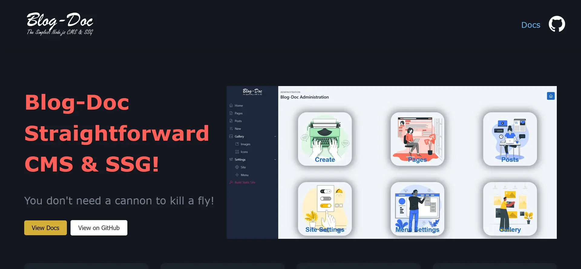
Blog-Doc
The Simplest Node.js CMS & SSG!
SME
Simple Markdown Editor
RAG
Responsive Attributes Generator
LiteNode
Node.js Web Framework
LiteNode Markdown
LiteNode Markdown Application Tutorial